Down at Newlyn harbour we gamely station ourselves on a stone jetty overlooking the harbour, armed with boxes of paints and a view of St. Micheal's Mount peering through the clouds.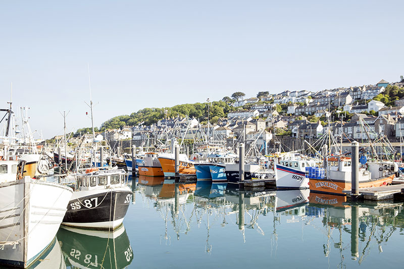
The fluorescent pinks and oranges of the buoys reflect off the bottle green, dandelion yellow and cornflower blue hulls of fishing boats; a pillar-box red lamppost glows against a granite backdrop; a rusting old wreck seems to collapse deeper into the brown-greens of its seaweed bed. I soon discover, however, that rarely is a colour one solid tone, unaffected by its surroundings.
When you begin looking at the true colour of things - not how you imagine the colour, but as it actually is - you endevour on an ever-changing visual adventure. The constantly changing affects of light and weather, gradiations, shadows and highlights, all shift and alter the colour.
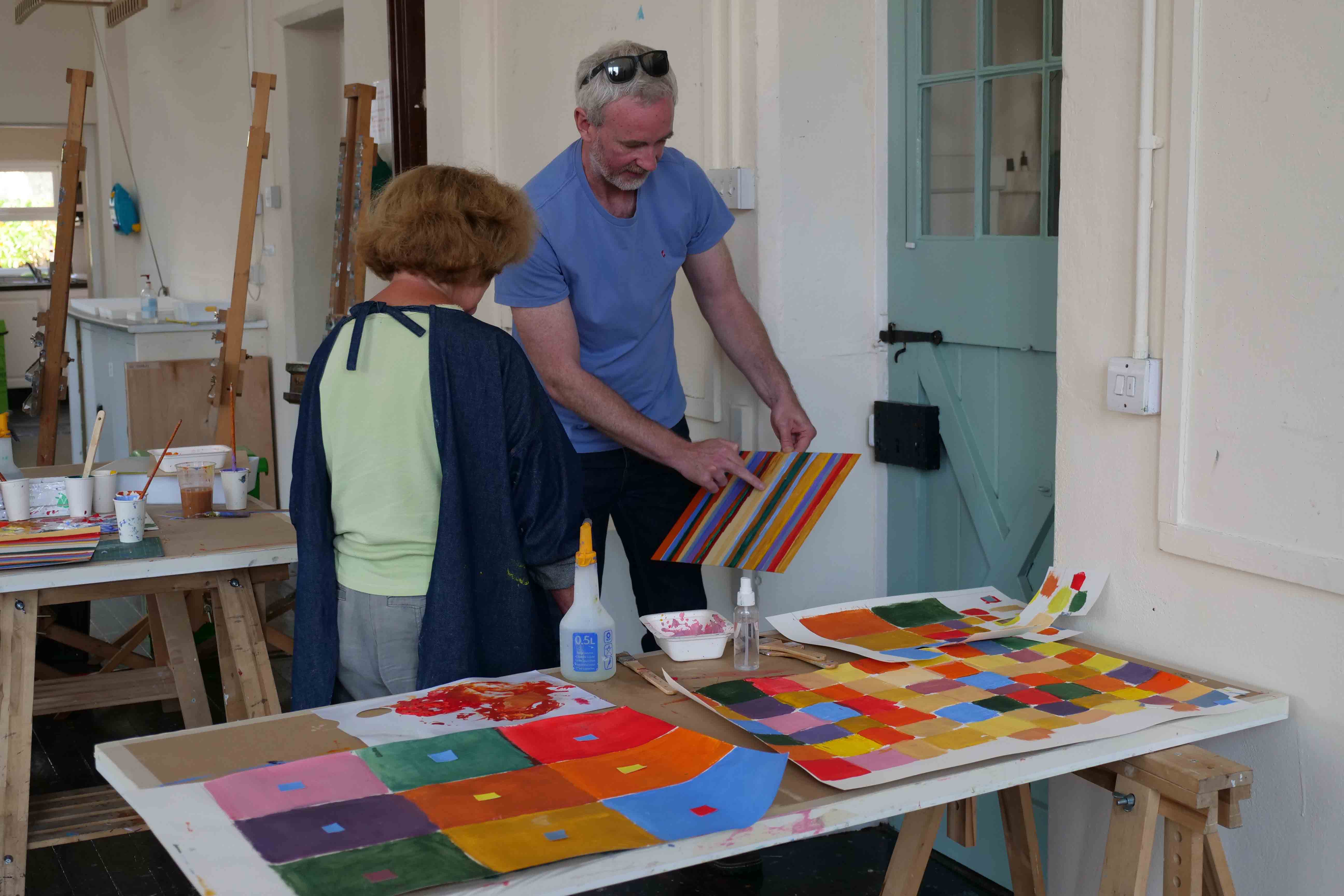
Our teacher and guide for this 2-day Exploring Colour course is contemporary abstract artist Luke Frost. Abstract art is a central theme in Luke’s family – his father is artist Anthony Frost, and his grandfather was acclaimed Modern British artist Sir Terry Frost – so, naturally, Luke has always had an interest in exploring colour. Having studied at Falmouth College of Art and Bath Spa University College, he was awarded a residency at the illustrious Porthmeor Studios in St Ives, and was Artist in Residence at Tate St Ives. His work is pared back, sophisticated and vibrant.
Earlier, over tea, in the Victorian school studio, Luke had shown us images of his work, telling us a little of where his inspiration and influences come from. We browsed through images of the work of several artists, including Joan Miró and Henri Matisse. But it was the American abstract expressionist painter Barnett Newman that had the biggest impact on Luke’s work. One of the foremost colour field painters, Newman created vast paintings, enveloping the viewer in colour. For Luke it was a game-changer, and from then on he sought to bring this simplicity and intensity into his own work.
During our two days together, Luke told us, we will be exploring how the language of different colours changes and interacts when they are placed together. “I want you to go with it, to work quickly and playfully, and start getting a sense of how some colours can really vibrate against each other in an interesting way, and how others don’t. Don’t get bogged down by the details. It’s all about curiosity and experimentation.”
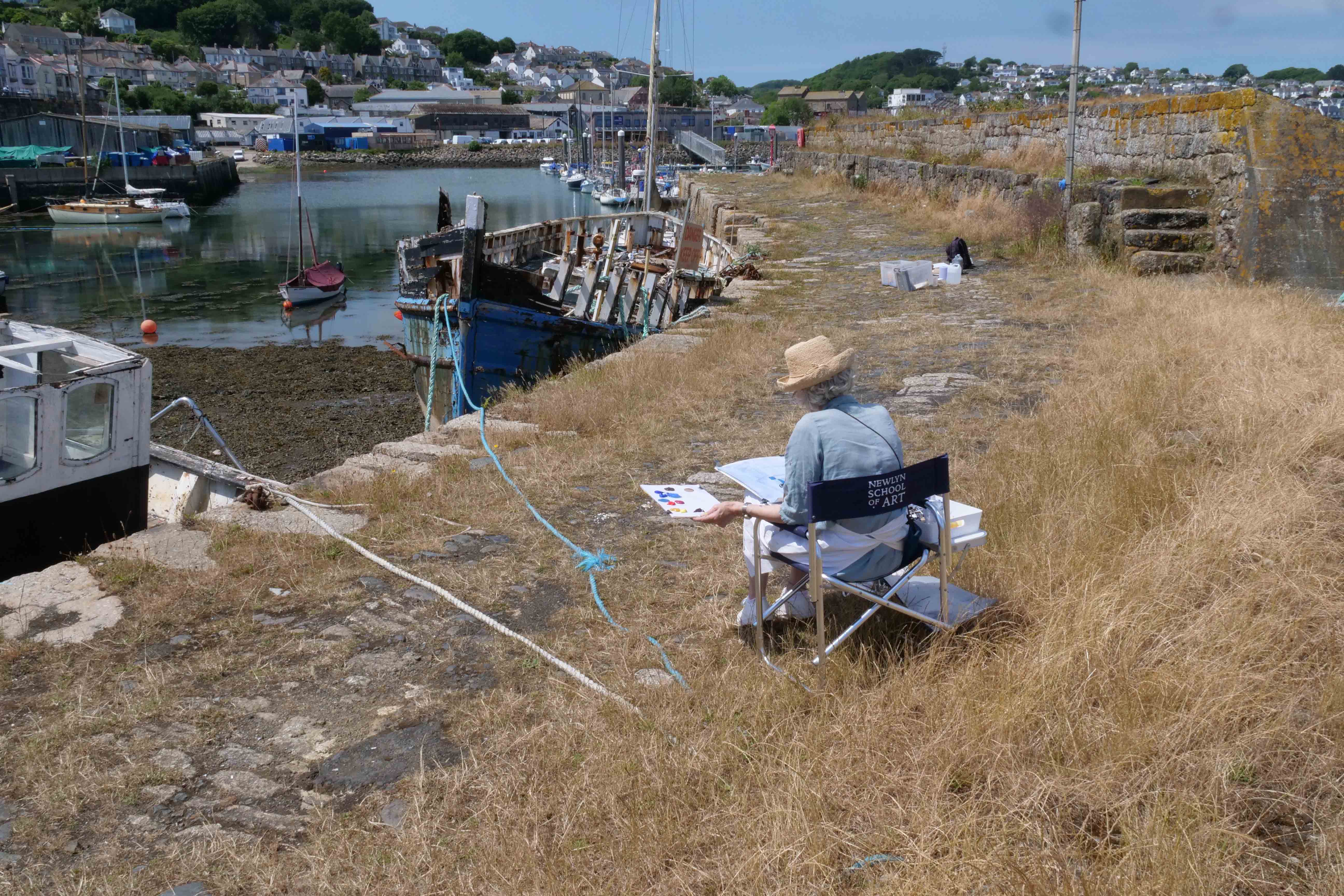
With this as our focus, the harbour is thrown into relief – there is vibrancy and subtlety of colour and tone everywhere. It's energising and exciting trying to figure out what to focus on, particularly when the scene in front of you is chock-full of colourful hulls, buoys, rope, fishing nets and suchlike. Luke urges us to simply cover our large pieces of paper in colour. How we do this is up to us; whether we want to do a representational painting, or pick out elements and forms and lay in blocks of colour. The aim is not to create a masterpiece, but to create a visual record of the colours that tell the story of the place.
I station myself beside a grounded wreck. Once a well-known fishing boat, it is now barely holding itself together. The patina of rust, peeling paintwork and weather-bleached timber makes for a fascinating study. A boatman pauses and points out that this may be the last record of the ship, as it is about to be removed and scrapped. There’s an added poignancy in trying to capture on paper the last hours colour of a ship that had so many stories to tell.
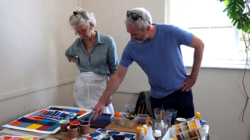
Back in the studio, we begin to create blocks of colour on paper, matching or exaggerating the colours from our earlier paintings, and laying them down in solid squares. Later we’ll use these to see how different colours respond to each other. The studio becomes quiet as we mix and paint, and repeat. Trying to capture and mix a singular colour from the cacophony of an earlier study takes a surprising amount of care and concentration.
The following day, using our colour blocks as our reference, we recreate the colours again, this time painting strips of colour on primed aluminium sheets – Luke’s preferred painting surface. The aluminium has a satisfyingly smooth surface but, not being absorbent like canvas, paper or board, it almost repels the paint, creating a very different feel and a beautiful object.
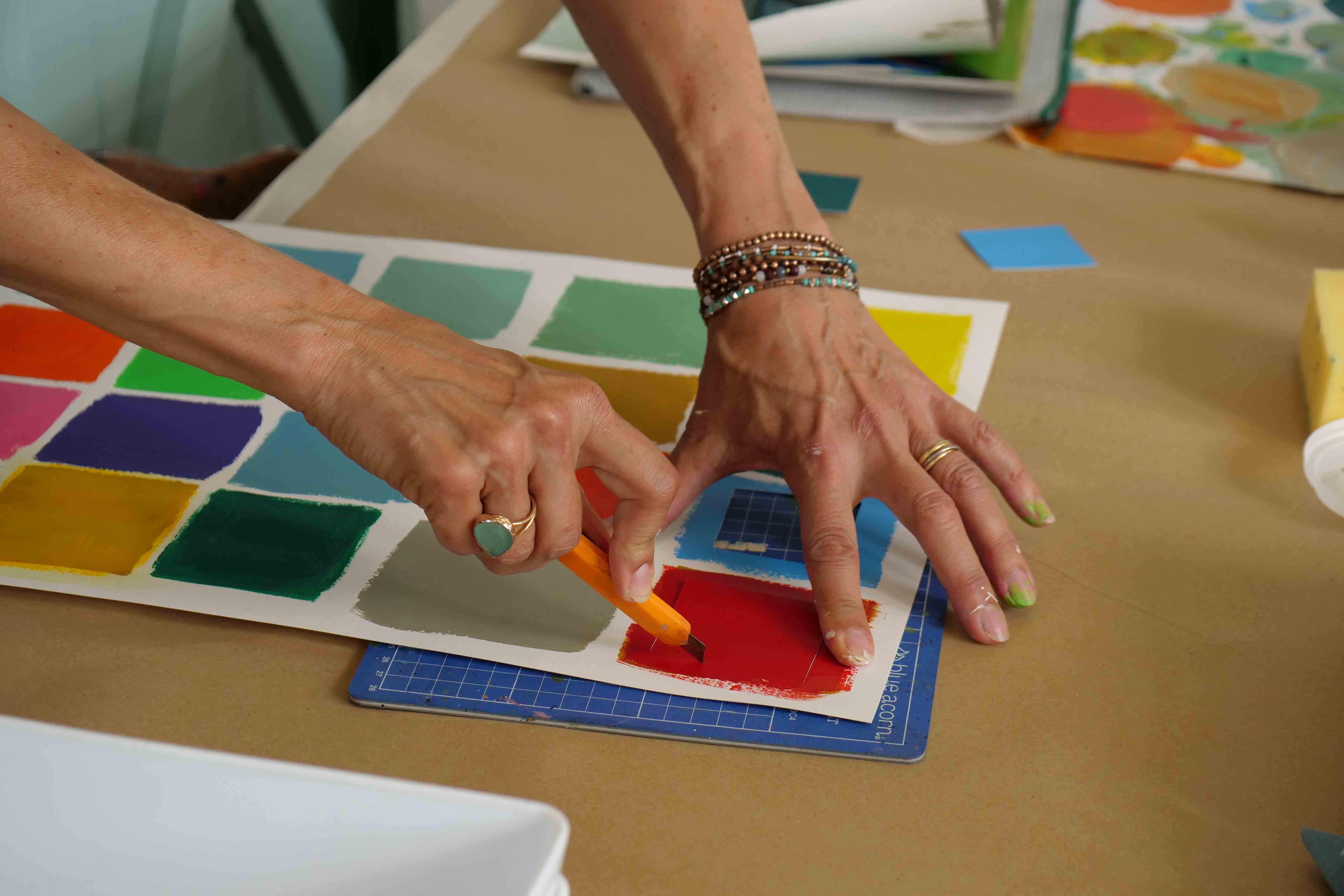
Now the colour palettes that we have created come into their own as we place one colour next to another, then another. Sometimes we need to over-paint lines, as the ‘conversation in colour’ jars or mutes those around it. One moment an artwork can be quite harmonious to look at, the next it can make you feel on edge. The power of each individual combination of colours and how that has an effect overall on the piece is extraordinary. Each of us has a particular palette of our own, reflecting our own experience of what we’ve seen and how we choose to represent it.
A final excursion back to the harbour is a chance for us to put our new-found observational skills to the test. How we create our artworks this time is quite different, though it is less than 24 hours since we were last there. Some create new colour field paintings; others create bold, colourful representational studies.
We all leave with armfuls of exuberant artworks. I drive home seeing the world around me in a different way. I realise that I’m far more aware of subtleties of tone and contrasting colours, making a mental note of them all.
The take-away from this course for me, was to be reminded of the joy that can be found in simply looking, really looking, at the poetry of colour all around us.
Find our more about Exploring Colour here!